Today, we’re excited to introduce an evolution of the Optera brand, with a simplified logo and colors that reflect the energy, innovation, and focus we’re bringing to the emissions management software space this year and beyond.
![]()
A brief history of Optera’s brand
This new look and feel marks the next phase of Optera’s journey. It builds on our history from a boutique sustainability consulting firm, to an early-stage software startup, to today’s rapidly growing and trusted software provider for many of the world’s leading companies.
The early days: Boutique consulting firm
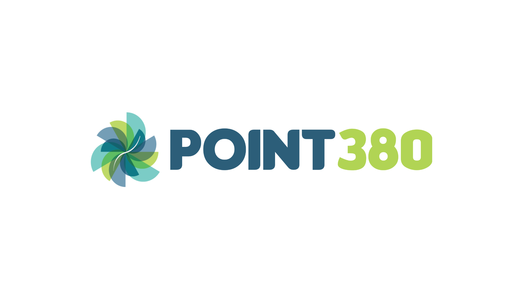
Founded in 2006, Optera originally operated as a boutique corporate sustainability consulting firm called Point380. Our founders were key contributors to ground-breaking publications – Winning the Oil Endgame, Reinventing Fire, and The 3% Solution – that informed the foundations of corporate climate action. In these early years, Point380 worked with many of the world’s largest corporate sustainability programs, learning firsthand about the biggest challenges in corporate sustainability and helping our clients work through cutting-edge initiatives.
2021: Optera is born
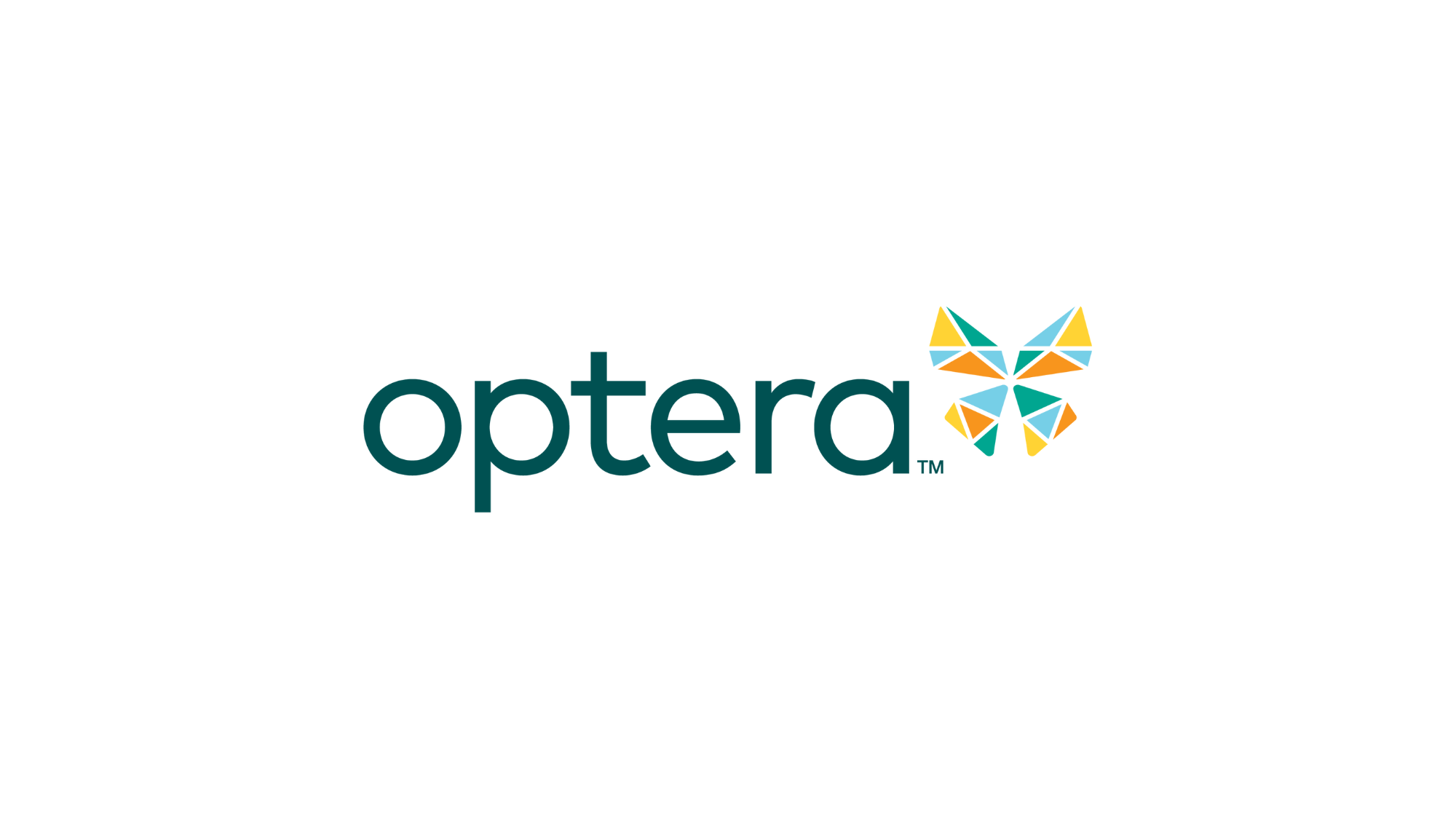
By the mid-2010s, it became clear that consulting alone couldn’t move the needle on corporate sustainability. We rebranded to Optera in 2021, marking the significant shift in our company’s strategy as we delivered scalable software solutions to the key challenges our clients faced.
The name Optera blends two root words: Optic (a lens providing insight) and terra (a focus on the earth). It is also inspired by the Monarch butterfly, a member of the Lepidoptera family, a species that makes an annual 3000-mile migration and one that is highly susceptible to climate change. This butterfly became a key figure in our logo and brand identity, with angular colors within to reflect our analytical expertise within more natural form.
2023: Optera evolves and scales
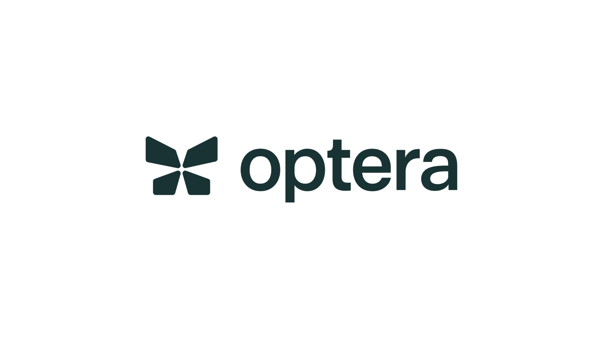
Five years after the launch of our first software tool, we’ve grown to a comprehensive suite of products, a team of more than 50, and a roster of clients collectively tracking more than 225M+ metric tonnes of CO2e and $187B in supply chain spend in Optera’s software. We’re poised for even more growth this year, all of which necessitated a brand that could scale and grow alongside our product and team.
The butterfly is still core to our identity – now in a more simplified, streamlined, and scalable design that will be more accessible to our audience. The new color palette reflects this next phase of our product too – it’s vibrant and exciting, but also scales to more uses and is more flexible for our team to grow and innovate within.
The next phase of Optera
For our current customers, you’ll start to see this new brand identity roll out across our website, products, and materials from the Optera team in the coming weeks. Nothing about our product offering changes with this launch – but you will likely notice a more streamlined look and feel coming from the Optera team moving forward.
We hope that this new brand excites you…it certainly excites us! It’s an important moment for Optera in our journey, ushering in the next phase of our business as we scale our impact in the fight against climate change. Thank you for joining us on this exciting ride!